A double-digit share of searches failing silently. Marketing spend driving traffic into unavailable products. No shared view of where conversions were being lost - or why.

The problem
Digital products generate data constantly - searches, clicks, failed queries, bookings, drop-offs. But that data lives across multiple systems: the front-end, the pricing engine, the availability layer, the CRM, the marketing platform. Each team sees their slice. Nobody sees the whole flow.
The result is that decisions get made on partial information. Marketing runs campaigns without knowing whether the product is actually available to the users they're acquiring. Pricing teams adjust rates without visibility into where searches are failing before price is even shown. Product teams optimise conversion without knowing how many drop-offs are caused by silent errors upstream rather than anything on the page.
The conversion loss is real - it's just invisible. Until someone connects the data.
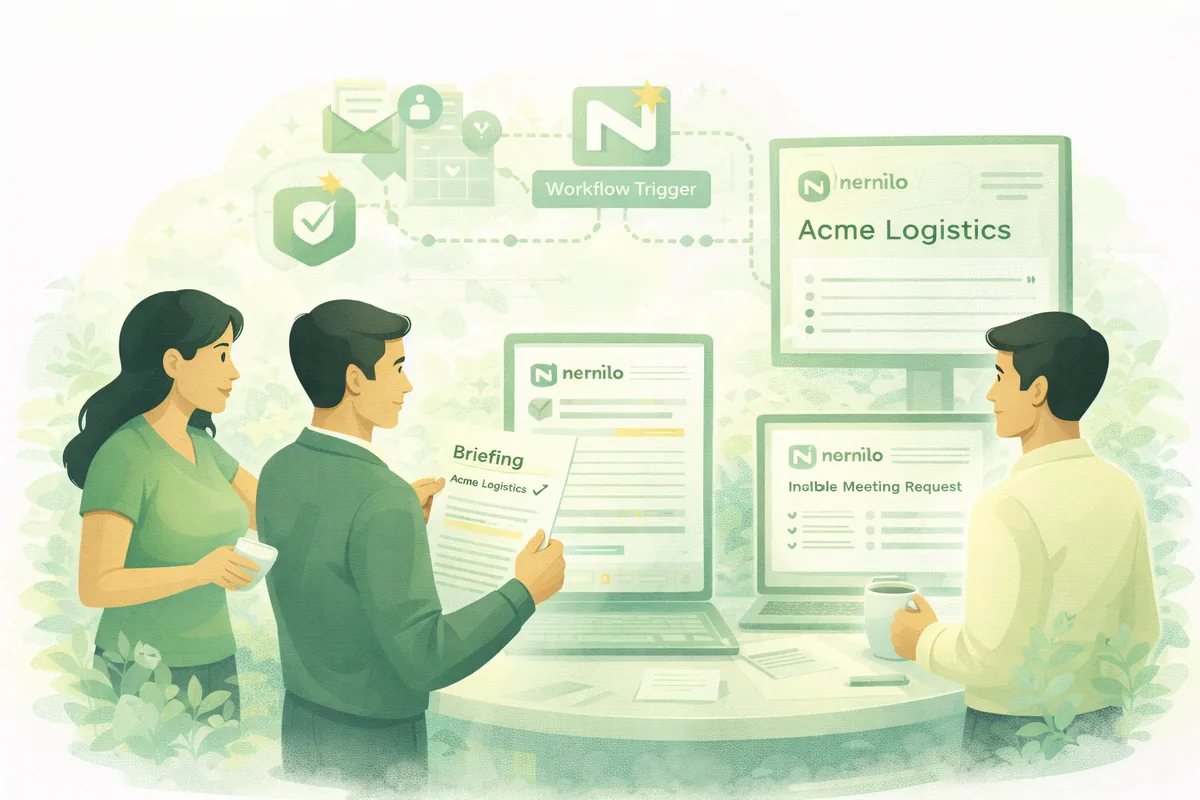
How we approached this
A global logistics company operated a digital booking product with a wide entry point and a long series of steps between a user's first search and a completed booking. Conversion was lower than it should have been, but the reasons were opaque - each team had theories, and nobody could prove them.
We built a unified, instrumented conversion dataset by connecting the front-end interaction data, the underlying availability and pricing systems, and the booking outcomes into a single structured layer. That made it possible to see, for the first time, exactly where value was being lost at each step - and to stratify it by dimensions that actually mattered operationally: how far ahead the booking was, whether capacity was open or closed, whether pricing had been published, whether the search had returned results at all.
What emerged was immediately actionable. A double-digit percentage of searches were failing not because of availability or pricing, but because of user input the system accepted silently without telling the user nothing would be found. Marketing was running acquisition spend against routes and windows where the product couldn't serve the resulting demand. Pricing and availability patterns that should have followed a clear strategy were visible for the first time in a structured review.
The output was a set of dashboards used jointly by product, pricing, and marketing - a shared view of the same underlying reality, replacing the competing spreadsheets and partial exports each team had been working from separately.
What this looks like in practice
Conversion-flow visibility work always starts with mapping what data actually exists and where it lives - not what the system architecture diagram says, but what's actually being captured, in what format, with what latency. The gap between "we have that data" and "we can use that data" is usually larger than expected.
From there the work is connecting the sources into a shared layer, defining the flow steps and the falloff metrics that matter, and building a view that different teams can use without needing to re-export and reconcile separately. The value isn't just in the dashboard - it's in the shared definition of what good looks like and where the gaps are, which is often the more valuable output of the process.